Composition & Perspective · Beginner Guide
The Rule of Thirds: A Complete Guide (and When to Break It)
Learn to place subjects with purpose, make stronger landscape and portrait compositions, and recognize the moments when breaking the rule of thirds creates a better photograph.
What Is the Rule of Thirds?
The rule of thirds is a simple way to organize the important parts of a photograph. Imagine dividing your frame into three equal columns and three equal rows. Two vertical lines and two horizontal lines create nine rectangles and four intersections. Rather than automatically putting your subject in the middle, try placing it along one of those lines or near an intersection. The result often feels open, directional and easy to read. It is not a mathematical guarantee of a good picture, and it is not a rule that a judge will enforce. Think of it as a starting point that helps you make deliberate choices about where the viewer looks first. A photo can follow the grid perfectly and still be weak if the light, moment or background is distracting.
How to See the Nine-Box Grid
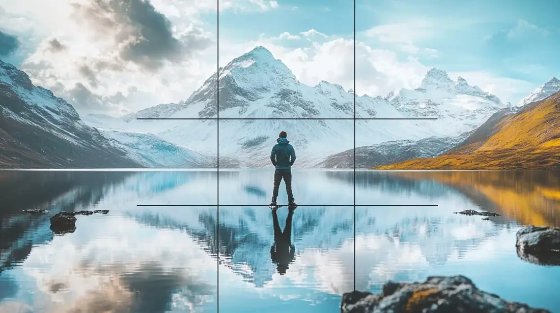
Turn on the 3-by-3 grid in your camera viewfinder, live-view display or phone camera settings. You will see two vertical and two horizontal guides. They are only guides and normally do not appear in the saved photo. The four places where the guides cross are often called power points. Try placing an eye, a flower, a distant person or another visual anchor near one of them. For a wide scene, put the horizon near the upper or lower horizontal line. The grid is a tool for deciding what deserves space, not a demand that every object touch a line. Keep checking the entire frame: corners, edges, empty areas and anything that competes with your subject.
Landscapes: Give the Interesting Half More Room
Landscape photography is one of the easiest places to practice thirds. If the sky is dramatic, position the horizon near the lower third so clouds, color and light dominate. If the foreground contains patterned rocks, a winding path or reflections, move the horizon toward the upper third. Keep the horizon level unless a deliberate tilt supports your idea. An off-center tree or cabin can become a strong anchor, especially when the open space shows where the scene extends. But do not crop away an important mountain peak just to force the horizon onto a guide. Ask what tells the story: sky, ground, a leading line or a recognizable subject. Compose around that answer.
Portraits: Place the Eyes, Not Just the Head
For a head-and-shoulders portrait, the eyes are usually the first thing a viewer seeks. Position the nearest eye around an upper intersection and allow some breathing room in the direction your subject is looking. This can make a candid portrait feel more natural than centering the face in every frame. If someone is looking to camera left, consider leaving space on that side rather than behind the head. Focus accurately on the nearest visible eye, especially with a wide aperture. Watch the background for poles, bright windows and objects that appear to grow from the head. For a close, expressive portrait, filling the frame or centering the face can be stronger than following thirds. The expression matters more than the grid.

Action: Leave Space for Movement
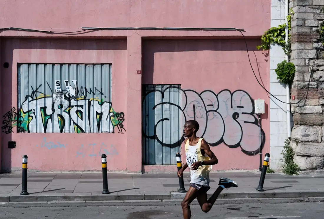
When a cyclist, child or running dog moves through the frame, try positioning the subject on one vertical third and leaving more room in front of the direction of travel. This is often called lead room. It gives the viewer a sense of where the action is going. Combine the composition with a shutter speed appropriate for the motion: 1/500 second or faster is a useful starting point for many active subjects, though faster movement may need more. Continuous autofocus and burst mode help capture the decisive expression or stride. Watch for limbs cut off at awkward points. Sometimes placing the athlete dead center creates the most dramatic image, especially when the movement is coming straight toward the camera.
Still Life, Food and Everyday Scenes
You do not need mountains or athletes to use thirds. Place a coffee cup near a lower intersection and let the tabletop, notebook or morning window light occupy the remaining space. Photograph a single flower to one side with a softly blurred background. A plate of food can sit on a vertical third while cutlery or a folded napkin balances the other side. Avoid adding props simply to fill empty areas. Negative space can create calm and give an image room for text, which is useful for blogs and social graphics. Before pressing the shutter, move one distracting item out of the frame and check whether the composition becomes clearer.
When to Break the Rule: Symmetry
A centered composition can be more powerful than thirds when the subject is symmetrical. Think of a hallway, bridge, building facade, reflection or a person standing between two matching walls. Align the center of the scene with the center of your frame and make the symmetry precise. Small accidental tilts and unequal margins become especially obvious in this style. Reflections in still water often work beautifully with a horizon close to the middle, giving the sky and its mirror equal weight. If the reflection is incomplete or one side is cluttered, shift the framing until the pattern feels intentional. Centering is not a mistake; it is a different visual strategy.

When to Break the Rule: Minimalism and Strong Central Subjects
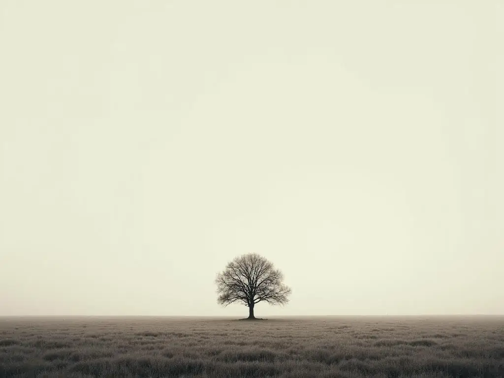
Minimalist photographs often rely on a single object and a large, quiet field around it. A lone boat in fog, a small figure on a blank wall or a single leaf on a clean surface can work in the exact center. The surrounding emptiness becomes part of the message. Centering can also communicate stability, confrontation or formality. For an intense close-up, a face looking directly into the lens may be more compelling when the eyes sit symmetrically around the center. In macro photography, the shape of a flower or insect may suggest a centered frame. Use the grid only if it improves the idea you want to express.
When to Break the Rule: Leading Lines and Repeating Patterns
Sometimes a road, fence, staircase or row of trees determines the composition more strongly than any intersection. If a line leads straight to a central vanishing point, centering can create a powerful sense of depth. Repeating patterns may look strongest when they fill the frame evenly from edge to edge. You can also deliberately interrupt a pattern with one different color or shape. Instead of asking whether the subject sits on a third, ask where the viewer's eye enters, travels and stops. A strong photograph has a visual path, and that path does not always match a nine-box grid.
Rule of Thirds vs. Golden Ratio
The rule of thirds divides the frame into equal thirds. The golden ratio, approximately 1.618 to 1, uses unequal proportions and is sometimes illustrated with a spiral or a different grid. Both are ways to think about visual placement, but neither is a secret formula for beauty. For beginners, thirds is easier to see quickly while shooting, especially on a phone. The golden ratio can be interesting for analyzing curved arrangements or a flowing scene, but it is rarely necessary for everyday decisions. You do not need to calculate anything in the field. Start with the simpler grid, observe how your photographs feel, and adjust when the subject calls for a different balance.
How to Enable the Grid on Your Phone or Camera
Most smartphones have a Grid option in the camera settings; on some devices it is in the main Settings app rather than inside the camera. Look for a 3×3 grid, composition guides or grid display. On mirrorless and DSLR cameras, check the shooting display, viewfinder or live-view settings for grid lines. The exact menu varies by model. Once enabled, practice using the grid without staring at it. First choose your subject and background, then glance at the guides to refine the framing. If the lines become distracting, turn them off temporarily and see whether you can predict where the thirds would fall.
A Five-Minute Practice Exercise
Choose a simple subject such as a chair, plant or person standing still. Take three photographs without changing the light. First, center the subject. Second, place it on the left vertical third. Third, place it on the right vertical third. Keep the horizon or major background lines consistent. Compare the three images at the same size. Which feels balanced? Which shows useful context? Which creates distracting empty space? Repeat with a landscape and make two versions: one with the horizon high and one with it low. Finally, try a symmetrical subject and see whether centering wins. This exercise teaches you to evaluate pictures rather than follow instructions mechanically.
Build a Sense of Balance Beyond the Grid
Visual balance depends on more than subject position. Bright objects attract attention; so do faces, saturated colors, sharp details and strong contrast. A small red umbrella can balance a much larger gray building. A dark subject on one side may need less space than a pale subject on the other. Look for visual weight as you frame. Also watch the edges: a cropped hand, half-visible sign or bright patch in a corner can pull attention away. Take one extra second to scan all four borders before shooting. If you have time, move your feet instead of relying only on cropping later. A few steps left or right can separate overlapping shapes and simplify the background.
Common Mistakes Beginners Make
The first mistake is treating the rule of thirds as mandatory. A subject placed at an intersection is not automatically interesting. The second is ignoring the background while focusing on the grid. A third is leaving space on the wrong side of a moving or looking subject, creating an uncomfortable sense that it is about to leave the frame. Another is placing the horizon on a third but forgetting to level it. Finally, beginners sometimes crop so aggressively to achieve thirds that the image loses context or resolution. When you edit, compare the original and cropped versions. If the centered image communicates more clearly, keep it.
Editing and Cropping with Thirds
Many photo editors offer a rule-of-thirds overlay when you activate the crop tool. Use it to test small changes to framing. You might move a portrait eye toward an upper intersection or shift a landscape horizon away from the center. Keep enough pixels for your intended output, especially if you plan to print. Straighten tilted architecture or horizons before making a final crop. Avoid cutting through hands, feet or important objects unintentionally. Editing is a useful place to experiment because you can compare several compositions from one photograph, but it cannot fully replace choosing a better camera position at the moment of capture.
A Simple Composition Checklist
Before taking the picture, identify the main subject in one sentence. Decide whether the scene benefits from space, movement, symmetry or intimacy. Check the background for distractions and scan the edges. If using thirds, position the key subject or horizon near a guide and see whether it helps. If centering creates stronger balance, use the center instead. Focus on the important detail, expose for the light you want to preserve, and take the photograph. Review the result and make one intentional change. This repeatable habit is more valuable than memorizing a list of composition rules.
Final Thoughts
The rule of thirds is a reliable beginner's tool because it encourages you to stop placing everything in the center by default. It can improve landscapes, portraits, action shots and everyday scenes by creating space and directing attention. But great composition is not about obeying a grid. Symmetry, minimalism, patterns and strong central subjects often work better when you break it. Use thirds to explore possibilities, compare your results and build confidence. With practice, the grid becomes something you can imagine without seeing it, and your choices become guided by the subject rather than by a formula.